- Aug 10, 2024
Beauty is hard... focus on 'interest' instead
- Toby Haseler
- 5 comments
This post contains affiliate links, these don't affect the price you pay, but I may get a small commission if you choose to buy using them. This is, of course, a huge support to my blog and YouTube and is greatly appreciated.
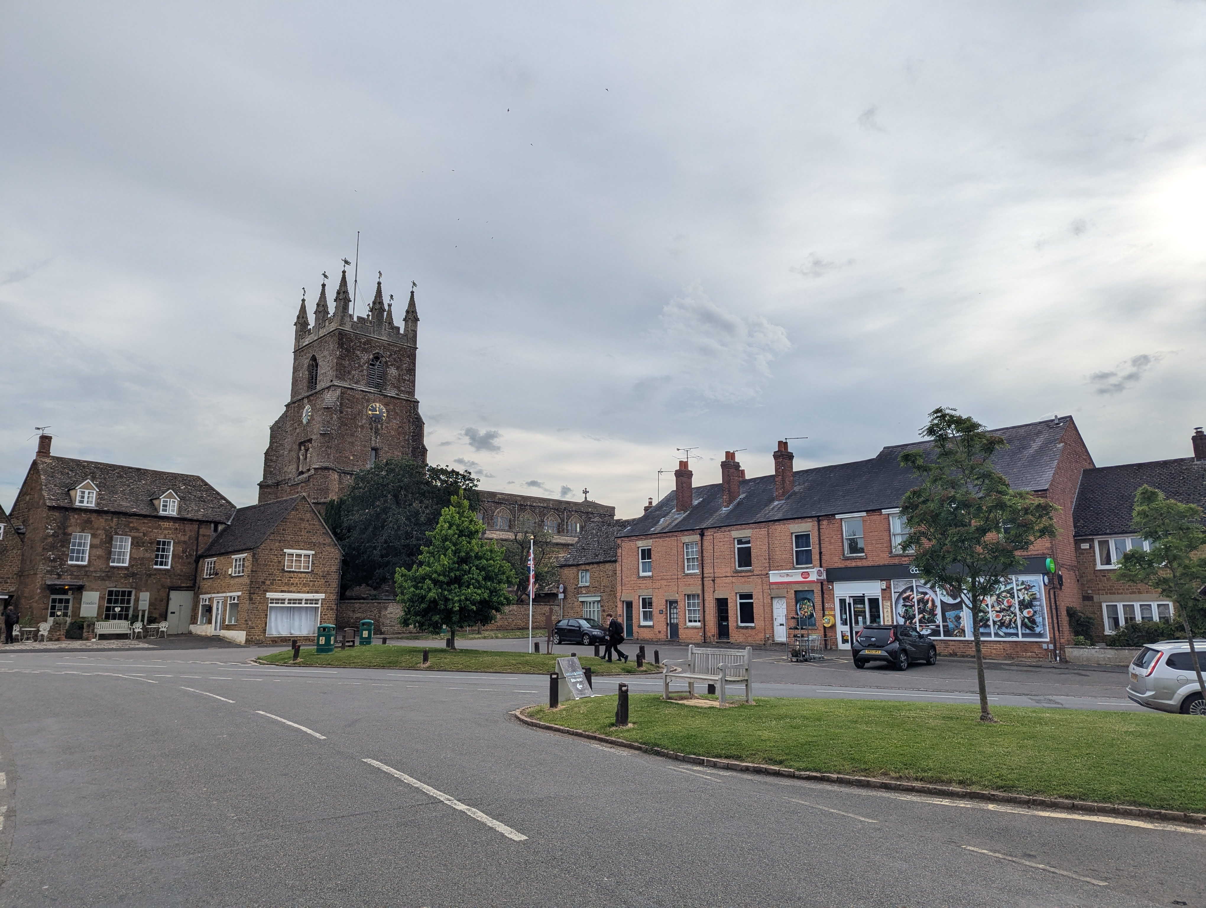
Just a couple of weekends ago I found myself in Deddington, a lovely village in Oxfordshire. I had enough time whilst I was there to sketch a couple of scenes, and I was able to give myself a challenge too, from which I learnt an awful lot.
Below is my journey, a step-by-step guide to this sketch and a link to my YouTube video to show you the whole process.
Deddington is naturally beautiful, but capturing natural beauty can feel like a trap! We don't analyse the beauty, we don't make artistic decisions, and we end up with a mess on the page. Which is, of course, demoralising.
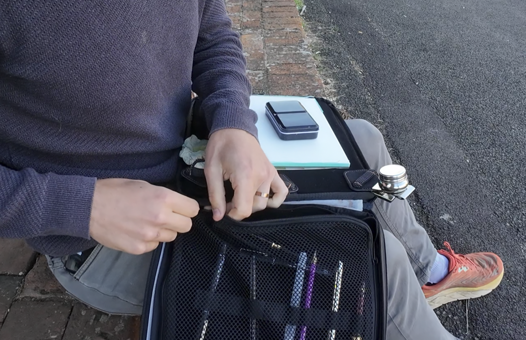
Supplies
I was out today with my 'full' sketching set up, this consists of:
Some cheap paper - Meeden's 10x7 inch cold pressed block
And my normal palette of colours
My Sketching Processes
The first step is to find your view and get comfy! Comfort is relative in sketching outside, and I didn't have a seat with me today - a little perch on these stairs was good enough for me.
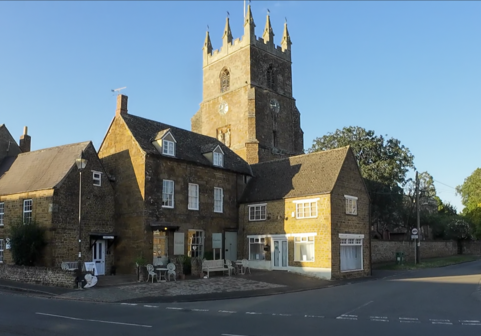
My viewpoint was looking up at Deddington's church, and my aim was really to ignore everything, except the shadows that I would focus hard on to produce a contrasting and slightly abstract image.
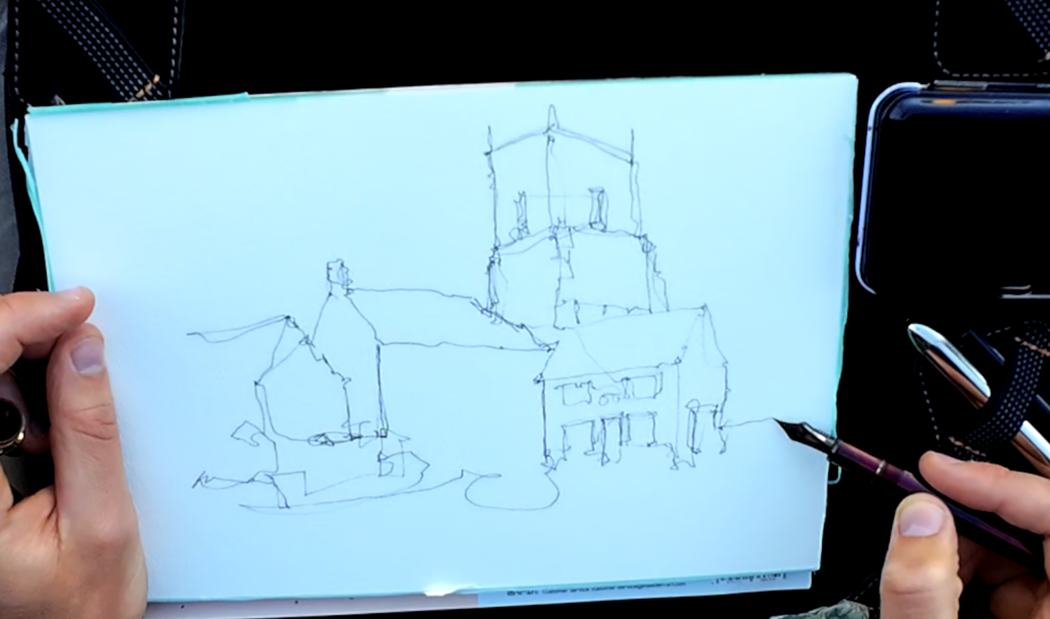
The beginning of my sketch is very very loose, using a continuous line that starts around the point of interest and really focusses mostly on creating the relationships between key shapes.
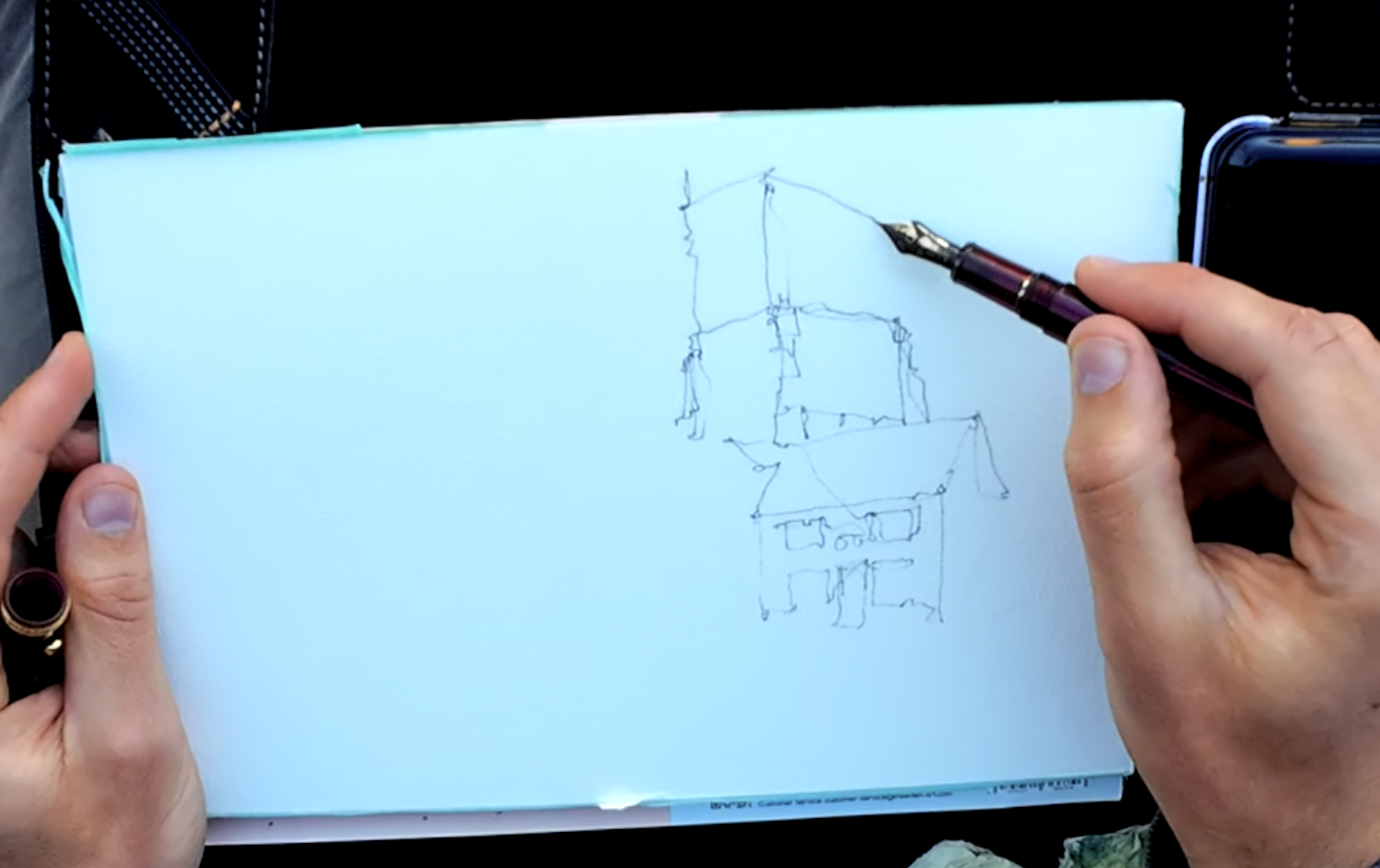
Notice how I hold my pen, very loose, not like a writer at all. I really find this helps me stay loose and also create a varied line.
Using this flowing process, I continue around the image, getting less accurate and less bold as I move further from the main point of interest.
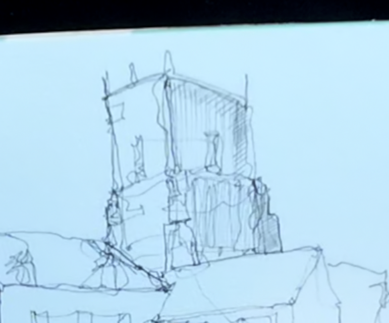
The next lines are adding details and beginning to work on the contrasts between light and dark that are so prominent in this view. Firstly with hatching and scratchy marks on the church.
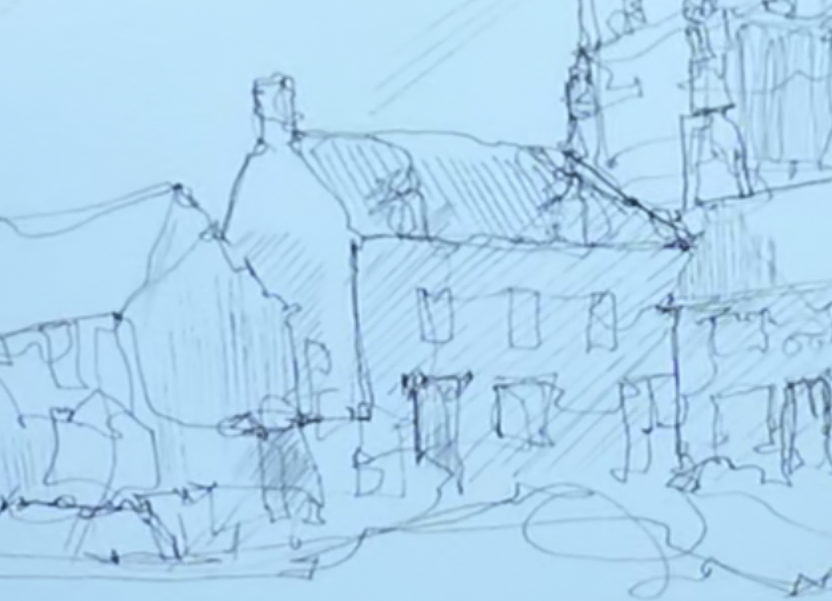
Before moving around the image as well with the similar intent.
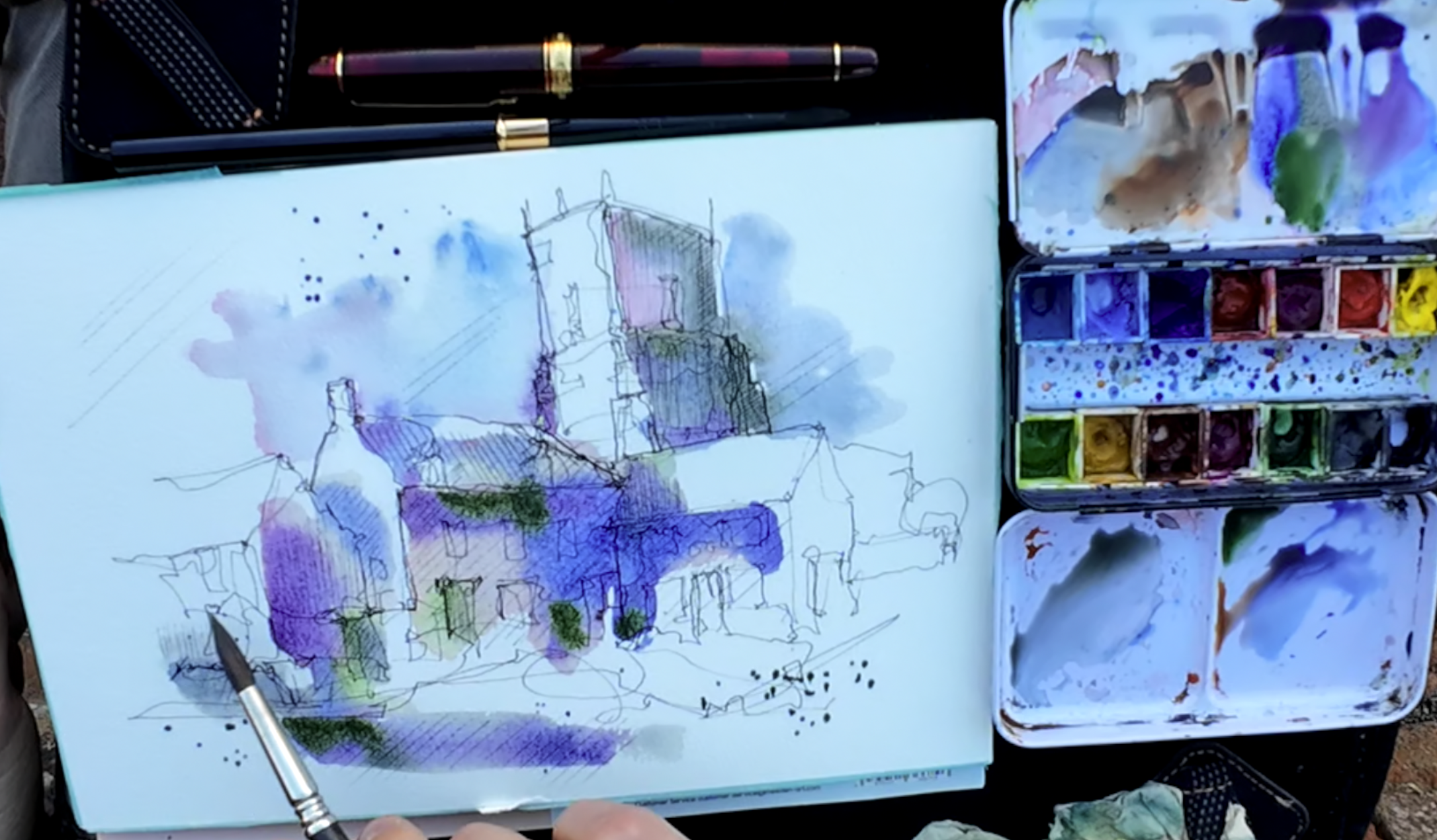
And that is the hard bit done! It's time now to let loose with flowing colours - I used here just 5 pigments. Ultramarine blue, rhodonite genuine, green appatite genuine, a tiny touch of lavender and quinacridone sienna.
The first wash flows over just the hatched portions of the sketch, focussing again on the shadows.
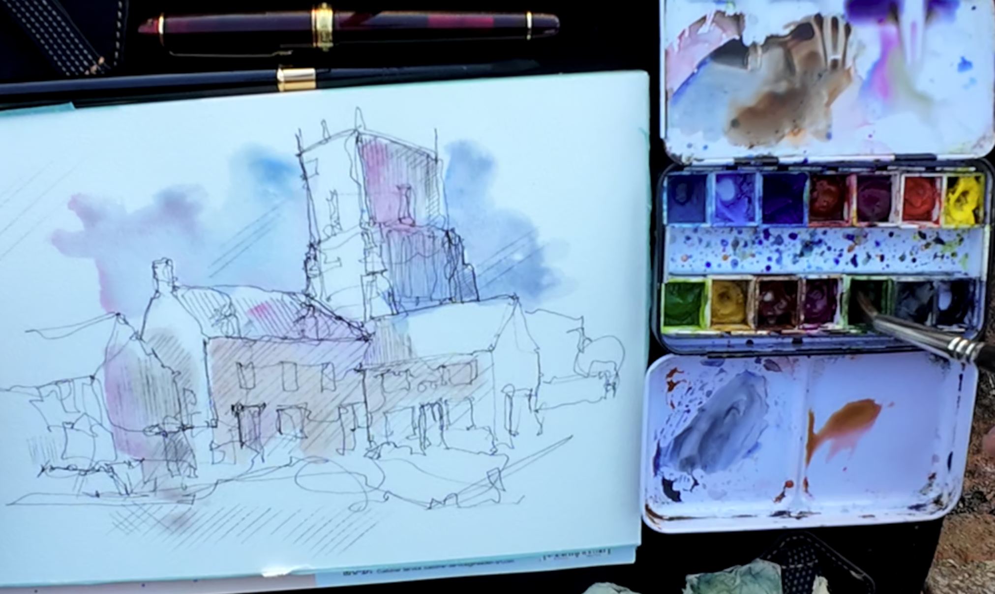
Before adding more intense colours, and allowing natural variation to give an abstract feel to the scene.
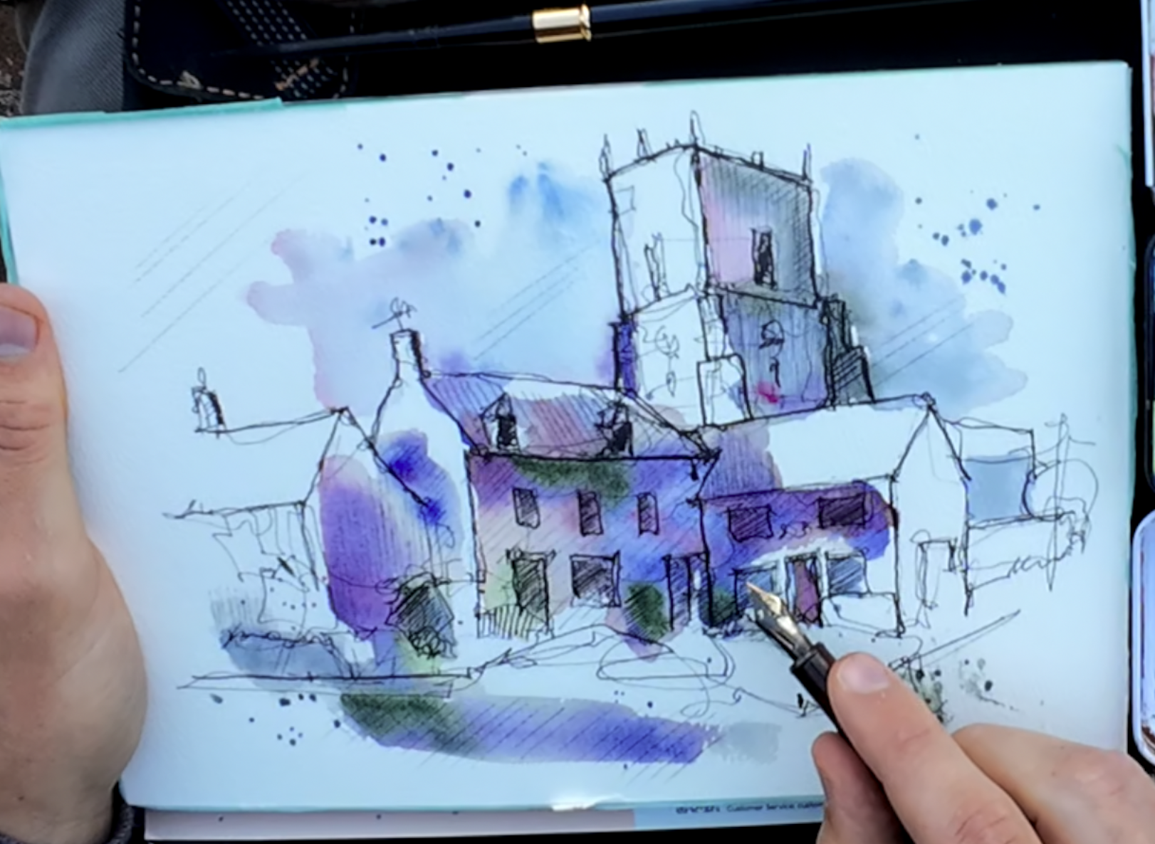
Whilst these colours look intimidating at first, after they have dried and we've added a little contour back, as well as some bolder marks and shadows, suddenly we actually have something that feels both of the scene and focusses only on what we set out to in the first place - the wonderful shadows.
Do take some time to watch the YouTube video (link here) and leave a comment with your thoughts :)
5 comments

wonderful done, very well explained, thank you!

Fab sketch. I'm trying to add more abstract colours to my work at the moment and have been a bit reticent about it. Your video explained and showed how to do so well that I'm more confident to try it now. Just have fun! Thanks, Toby.

thanks toby some of those colours are a bit tricky to buy here in nz

Great video! I just love the way you handled the shadows! I will give it a try.

Thank you, so funny 😃