Inverting our space (does it really matter?)
At first glance, the heading of this lesson may not make sense, but allow me to explain. In this video we are going to repeat a scene twice, through this we will be able to explore a whole load of techniques which I will also explain before. But we will also make decisions about where we leave space.
After deciding where we leave space though in the first scene, we will literally just 'invert' or 'do the opposite' in the second scene. Instead of painting the trees, we leave them blank, instead of painting the sky perhaps we paint the river.
THIS LESSON IS A BIG ONE - do scroll all the way down to read all the ideas/techniques and check out the examples.
Here are the shapes
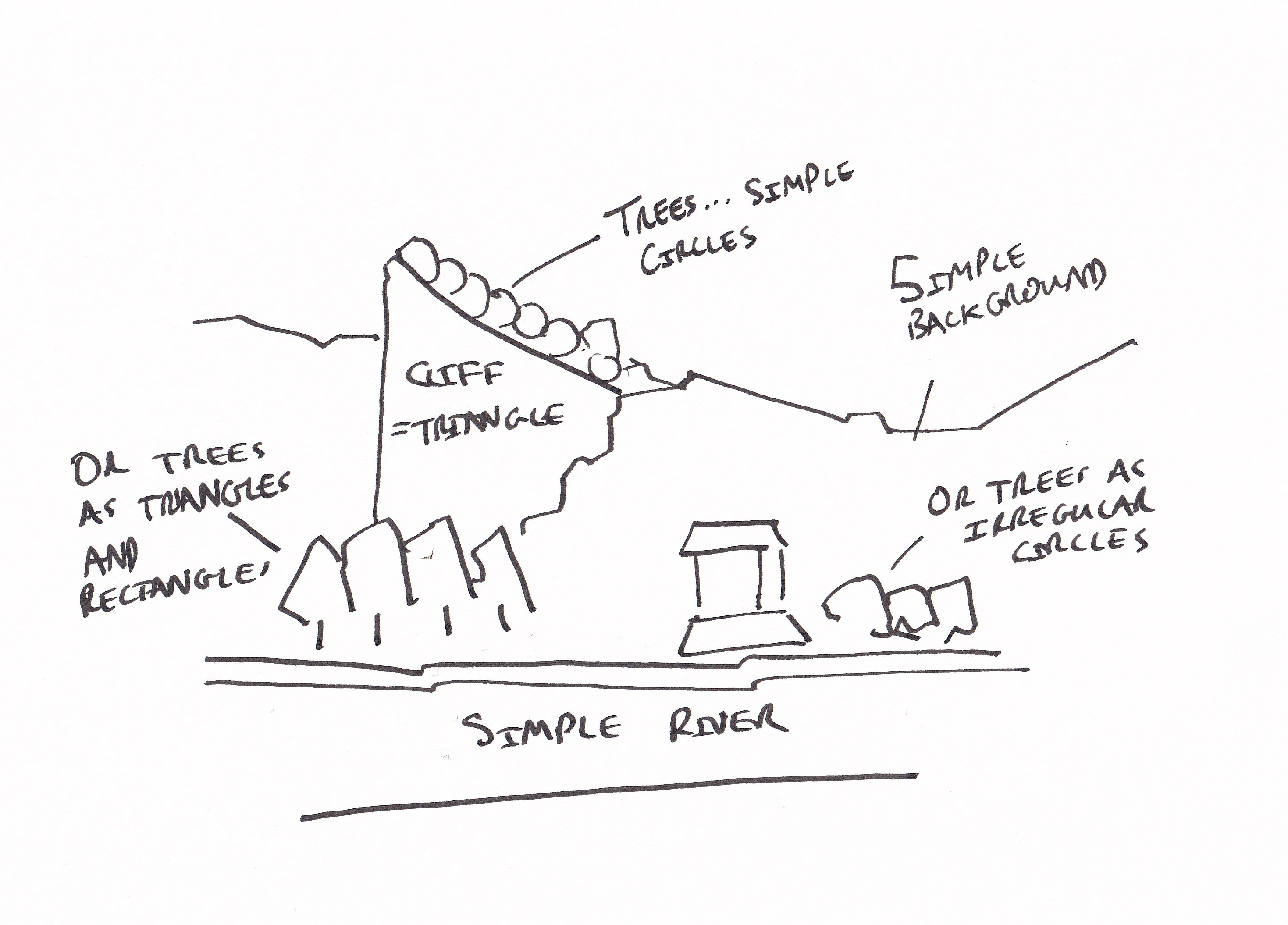
As we are seeking to replicate this scene it's important to find the shapes and keep them simple. The scene itself has an enormous number of potential shapes (are we going to, for example, define every tree?). But we can simplify this down by picking a few key trees and treating them as irregular or simple shapes as shown above.
The background then becomes simple (don't forget to add a bit of texture), and the house compared to the scenes we've tackled already is proverbial child's play!
Here is your reference:
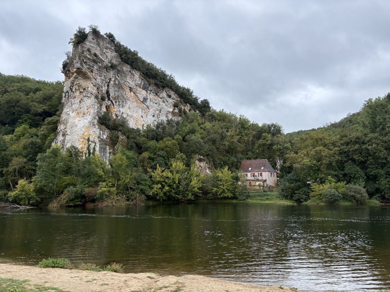
The huge limestone cliff on the left is one of the most recognisable features of the Dordogne valley region. This is a little house tucked in by the river close to Le Roque Gageac. The village is built right up against this cliff along the Dordogne River, and many of the houses sit tucked into the base of the rock.
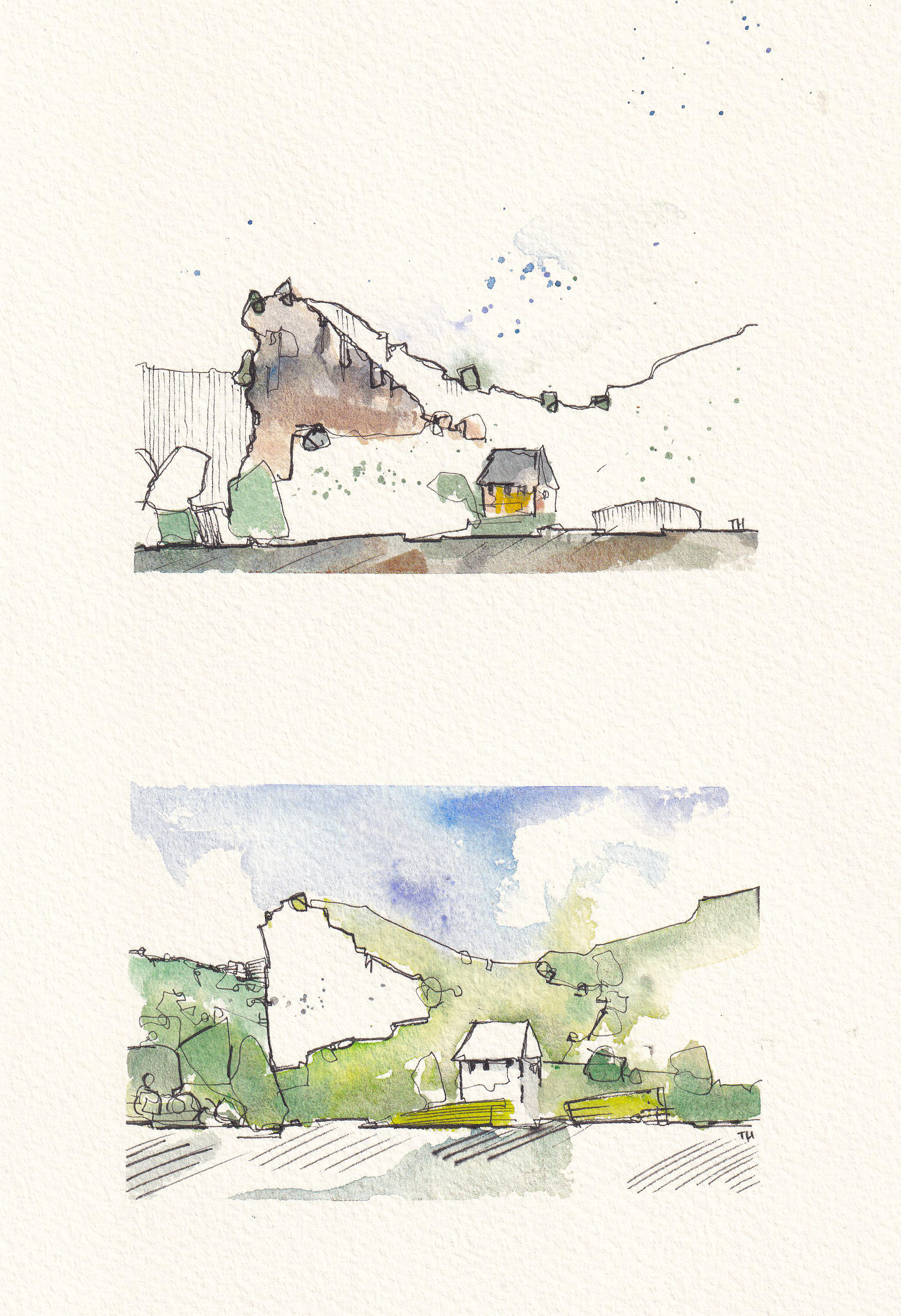
My finished version(s)
How to make decisions about space (*a practical summary)
It starts with ink
Deciding what to leave blank begins long before you pick up a brush. The moment you start your fine pen lines you are already shaping the space in your scene. Simple shapes with light, open textures keep your options wide because nothing is overcommitted. If you fill an area with detail early, you have already decided not to leave that space blank. If you keep it simple, you preserve the freedom to choose later. This is why the opening line stage matters so much. Minimal lines create room for later decisions.
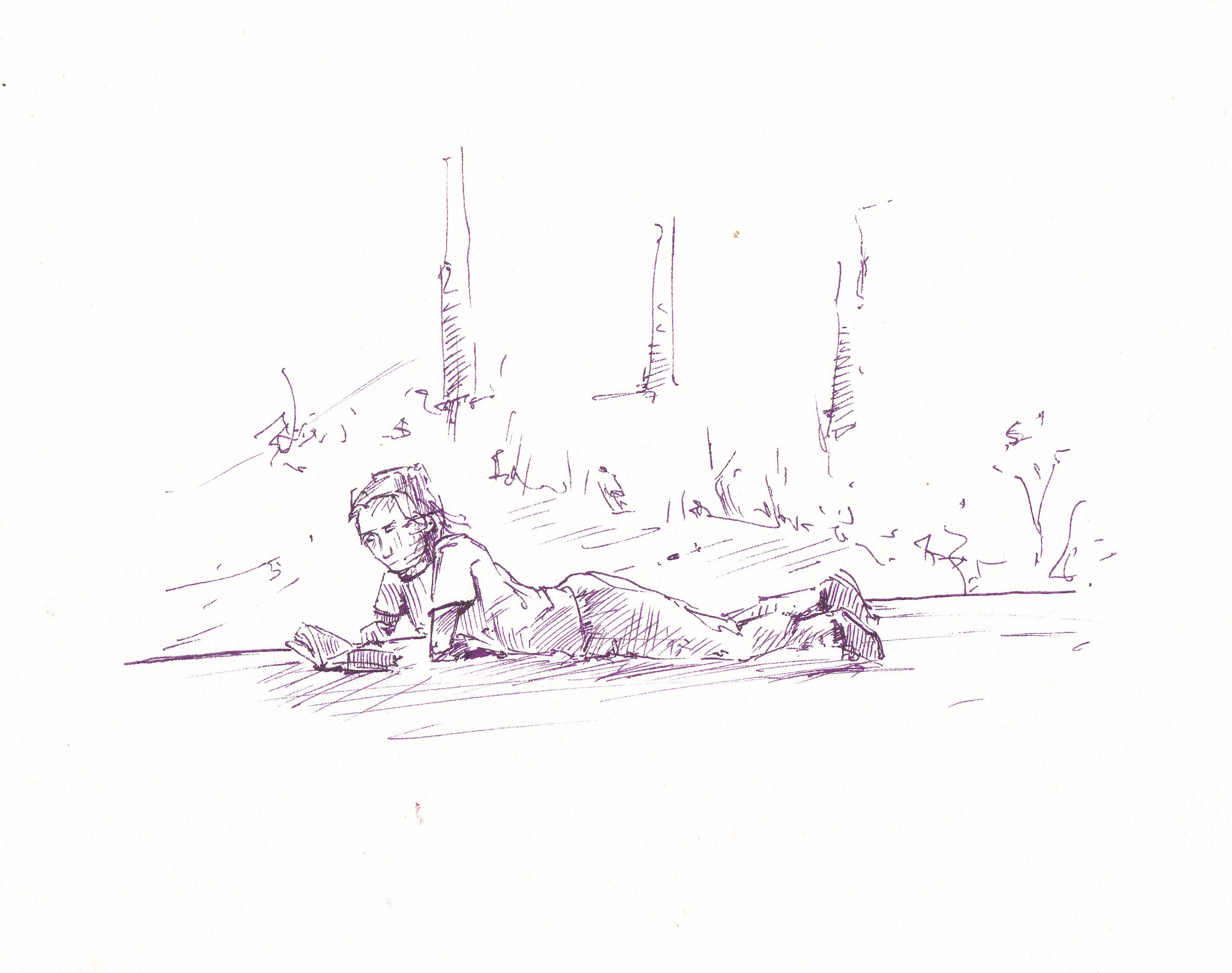
After the initial sketch you begin to decide where the space will sit by choosing which areas receive texture and which areas remain untouched. Textural hatching implies detail and pushes an area forward, so by using it you are actively choosing not to leave space there. You can see that in the complexity of the hatching on the figure above.
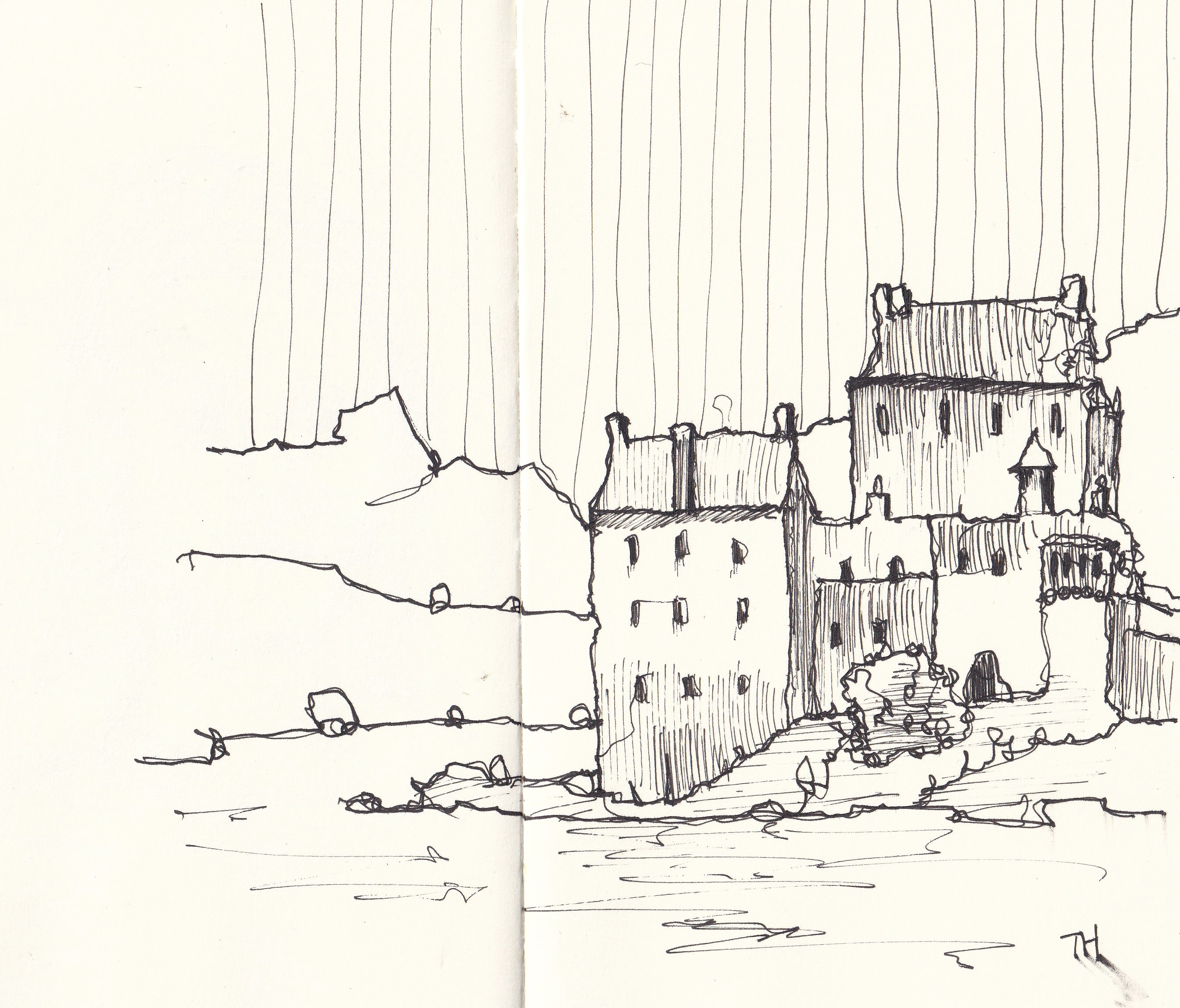
Simple hatching, in contrast, flattens an area and makes it feel calmer, which is very close to leaving it blank. It is still space, just softened space. If you want a distant, gentle, simplified zone, stick to simple hatching. If you want energy and focus, use textural marks.
Watercolour techniques and ideas
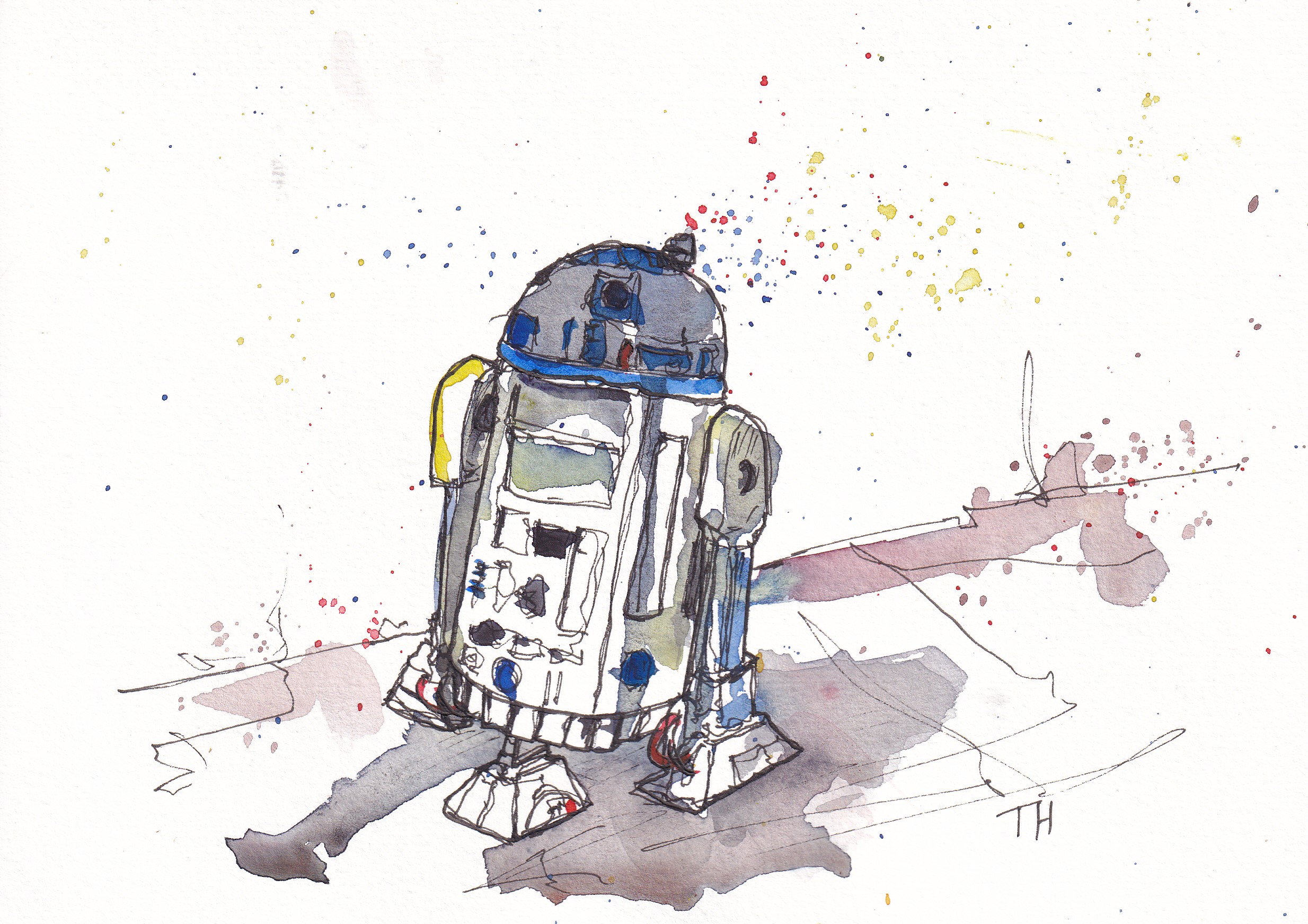
Splatters are another way to handle space without filling it. A large untouched area can look stark or accidental. A few splatters immediately make that same space intentional, while still keeping it open. The key is to use only a few. Splatters connect areas of the sketch without overpowering them and can break up emptiness without removing the feeling of space. Below, for example, could be a very bland portrait, but I think the splatters around fill out the space and make it feel intentional.
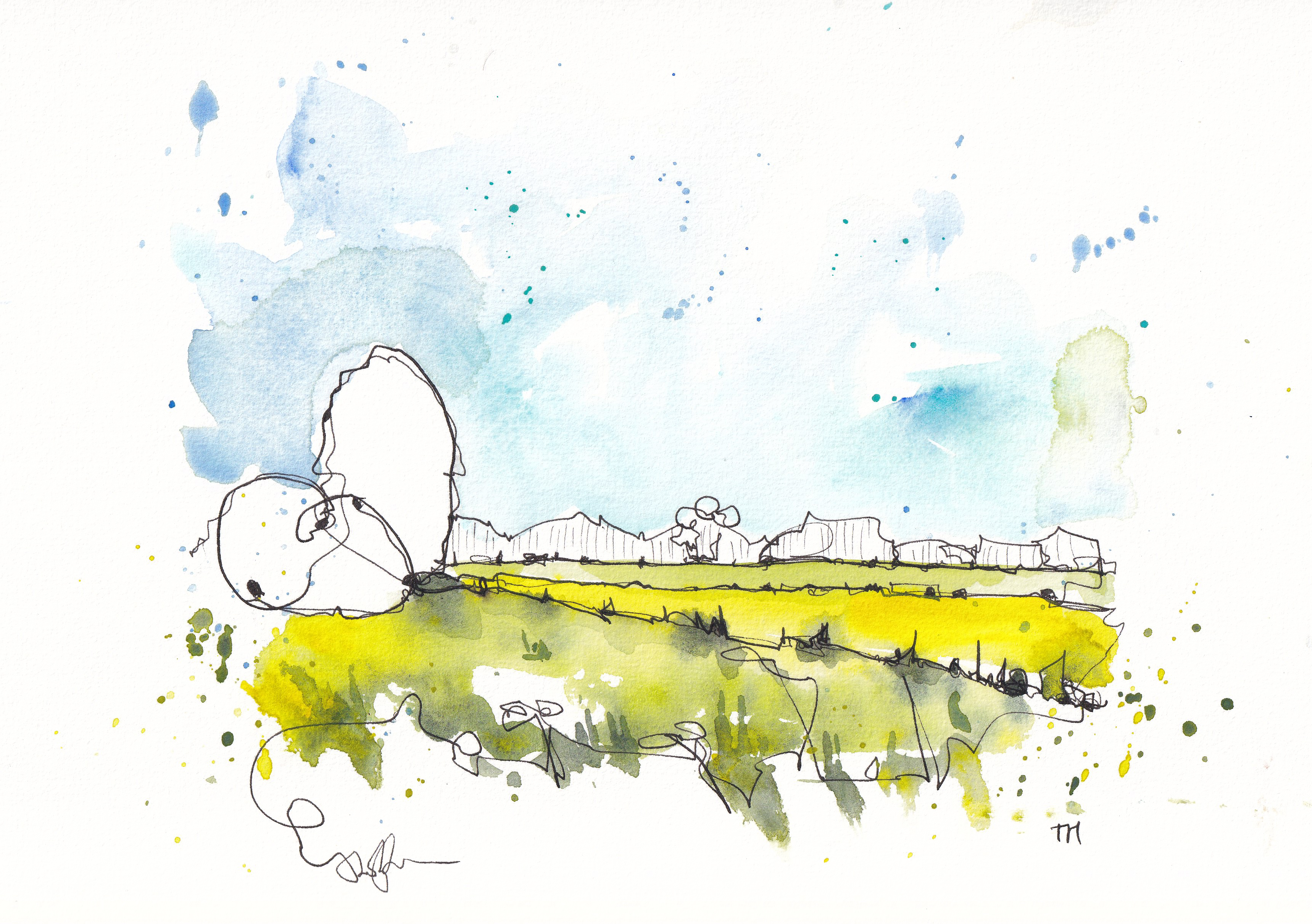
Varied washes belong to the opposite category. Instead of leaving an area blank, you fill it, but in a way that stays light and interesting. A flat single colour risks looking dead. A varied wash, with small shifts of green, blue, brown or yellow, keeps the area soft and alive. This is the technique you use when you want colour without fuss, complexity without detail and interest without losing the openness. It is a middle ground between full detail and empty space. Notice the variety in the greens in the foreground below, for example. As well as the use of open space in the trees and hatched space in the distance.
Wet-on-wet techniques soften edges and keep shapes dreamy, which works perfectly for parts of the scene that should recede. Wet-on-dry layering does the opposite. It creates crisp edges and busy overlapping strokes, which add depth and draw attention. So by choosing which one you use, you decide whether an area becomes space, softness or focus.
How a crisp line can increase the impact of space
Finally, bold ink is the strongest space shifter of all. A single crisp, confident dark line can instantly define an area and pull it into the foreground. That is why it must be used sparingly. Too many bold outlines flatten the scene and destroy the depth you have created. One or two in the right place give clarity to your space. Ten will crush it.
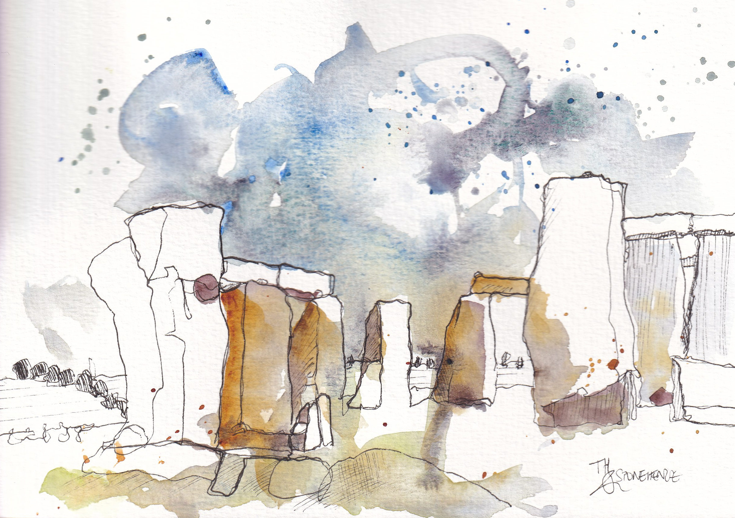
Across these decisions the principle stays simple. You choose space by choosing not to fill. You choose focus by choosing to fill with intention. And every technique either creates calm space, textured detail or something in between. The art is in knowing when to stop, stepping back often, and trusting that leaving something blank is not only allowed, it is powerful.
Specific prompts for specific places
Hopefully you have seen that the exact space we leave is rarely incredibly important, though the choice may change the feel of the scene. Here, however, if you want some additional prompts or ideas, are some examples of what you could try leaving blank in your next scene.
Urban scenes
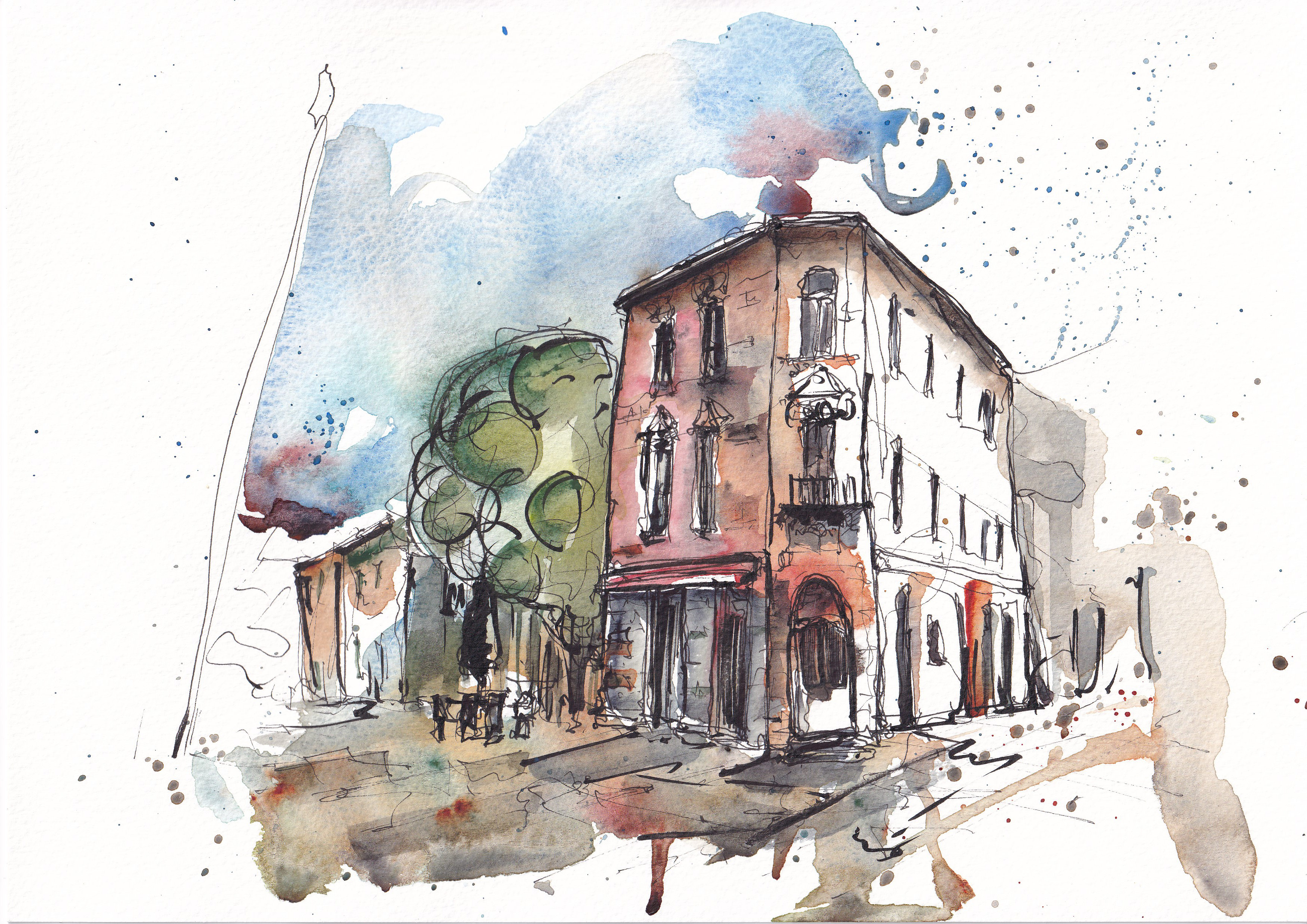
Leave one side of the street, or a building empty of detail or colour. Let simple hatching or nothing at all suggest the quieter side. this can also provide a sense of light and dark.
Leave roofs blank. They often act as leading lines, and gives you breathing room above the busyness of windows, doors and all the details that entails.
Leave the 'greens' blank. Focus your painting on everything man-made to give you a contrast not just in colour, but also in textures.
Landscape scenes
Leave large areas of grass or fields blank. A couple of splatters or tiny hatches are all you need for texture.
Leave distant hills blank. They disappear softly and push the foreground forward.
Leave sections of the river or water untouched. The untouched paper reads as sparkle and movement.
Foreground decisions
Leave the entire foreground blank except for a bold line or two, and maybe some splatters. This pulls attention into the scene.
Leave foreground shadows blank and outline them lightly. Then add one confident wash at the end if needed.
People and figures
Leave clothing uncoloured. A tiny sense of shadow through colour or hatching provides enough sense of personality.
Leave faces blank except for a single feature. It keeps the figures simple and stops you drifting into portrait mode.
Leave legs or feet suggested. A couple of lines anchor them without fuss.